

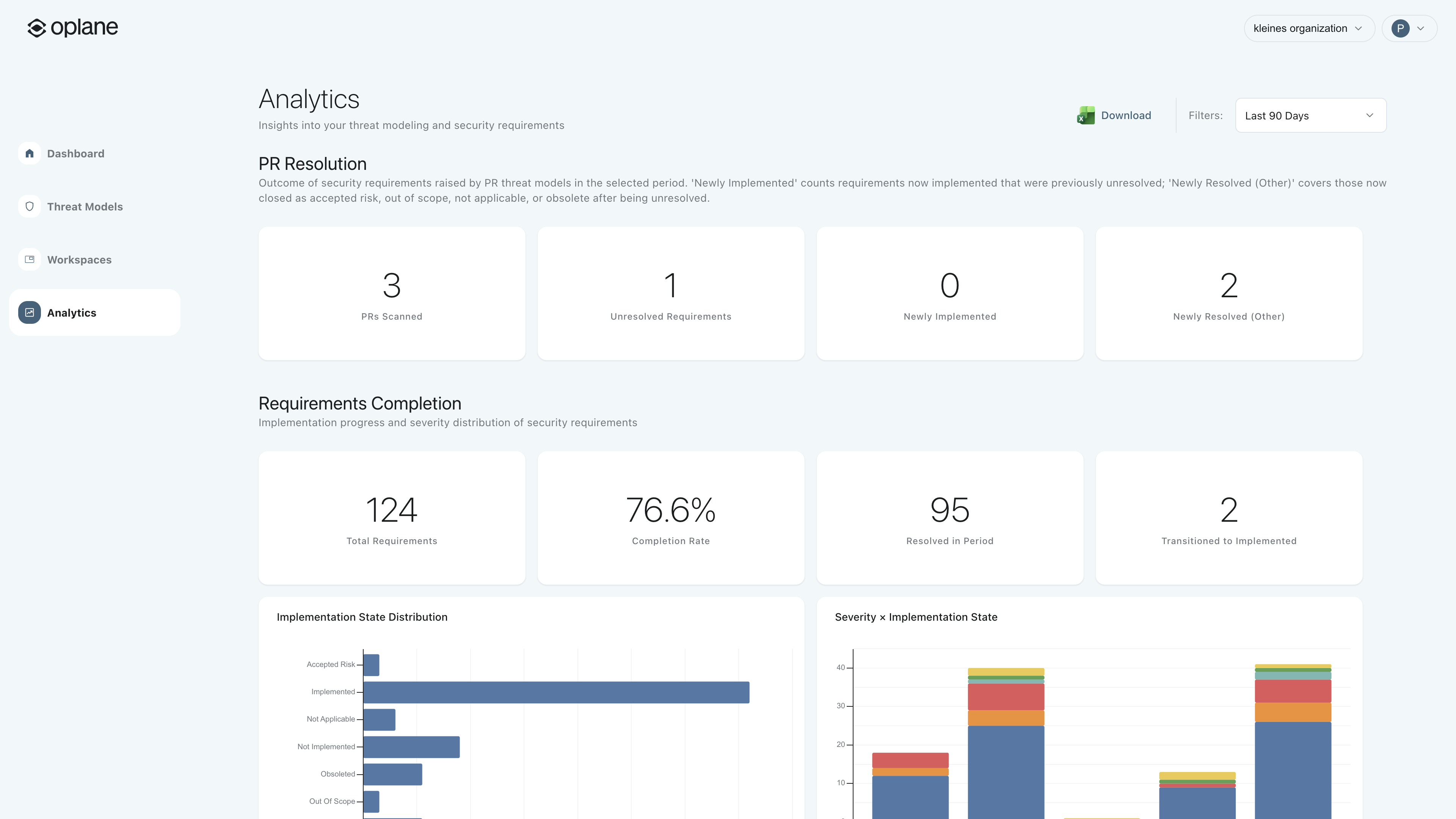
Dashboard sections
PR resolution
Tracks the outcome of security requirements raised by PR threat models in the selected period. Shows how many PRs were scanned, how many unresolved requirements remain, and how many were newly implemented or resolved.- PRs Scanned: Total pull requests analysed
- Unresolved Requirements: Requirements still open
- Newly Implemented: Requirements that moved to implemented
- Newly Resolved (Other): Closed as accepted risk, out of scope, or not applicable
Requirements completion
Implementation progress across all security requirements in your organisation:- Total Requirements: All requirements generated
- Completion Rate: Percentage resolved (implemented + accepted risk + out of scope + not applicable)
- Resolved in Period: Requirements resolved in the selected time window
- Transitioned to Implemented: Requirements that moved from unresolved to implemented
Adoption
Measures how many repositories in your organisation have threat modeling enabled:- Covered Repos: Repositories with an active repo-connected workspace
- Uncovered Repos: Repositories without threat modeling
- Onboarded in Period: Newly connected repositories
Threat model sources
Shows where your threat models come from:- PR Analysis: Generated automatically from pull request reviews
- Agent (MCP): Created manually via MCP from an AI assistant
Filtering
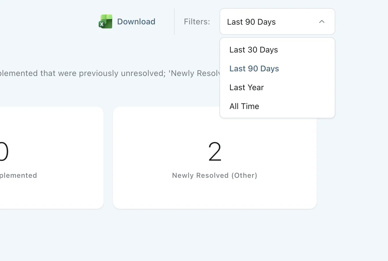
Use the time period filter in the top right to adjust the dashboard view:- Last 7 days
- Last 30 days
- Last 3 months
- Last 6 months (default)
- Last year
Export
Click Download to export the dashboard data for reporting or sharing with stakeholders.Workspace analytics
Each repo-connected workspace has its own Analytics page in the workspace menu. It shows what happens to the security requirements Oplane raises on that workspace’s pull requests, so you can see how many of them your team fixes before the pull request merges. Use it to check whether a team acts on PR findings, or to compare how well critical findings get fixed against lower severities.PR fix outcomes
The top of the page shows three all-time totals. The time period filter does not apply to them. Each requirement raised on the workspace’s pull requests counts toward one outcome:- Resolved pre-PR: The requirement was already resolved the first time Oplane assessed it on the pull request.
- Resolved in PR: The requirement was not implemented or partially implemented when Oplane first assessed it, and was resolved before the pull request merged.
- Unresolved at merge: The pull request merged while the requirement was still not implemented or partially implemented.
Fixes in PR by severity
The Fixes in PR by Severity charts show the share of each outcome over the selected period, as Fixed before PR, Fixed in PR, and Not fixed in PR. There is one chart for all severities, followed by one chart per severity level. Use the same time period filter as the organisation dashboard to change the range.Read next
- Insights with MCP, to ask your AI assistant questions the dashboards don’t answer.
- Merge gating, to stop unresolved requirements from merging.
- Statuses and severity, for what each status and severity counts as.